Why an Aurebesh font?
We recently released an Aurebesh font. We call it Aurebesh Pro. You can grab it here. But I wanted to write something about why we made it. What things it does do. And maybe what it doesn't do.
Why release an Aurebesh font?
First off, cause I wanted to. Secondly, cause I have never made an actual font with a real font app, and I wanted to get to know Glyphs App better. Thirdly, cause I needed it. I figure other people might need it too.
What's so special about Aurebesh Pro?
Nothing really, but it's inspired by a modern fonts ability to be variable. That means it can have these points of weight that might sit in between regular font weights.
A variable font was intriguing to me, as was getting multiple weights of an Aurebesh font. And while producing multiple weights of the glyphs was a significant amount of work, I couldn't stop thinking about how much simpler my life could be if I just had a different weight.
The multiple weights would help me out greatly. When I created designs that use Aurebesh letterforms, I didn't want to spend loads of time re-weighting letters. Otherwise, I'd hand letter the whole thing myself. Which still happens, just far less.
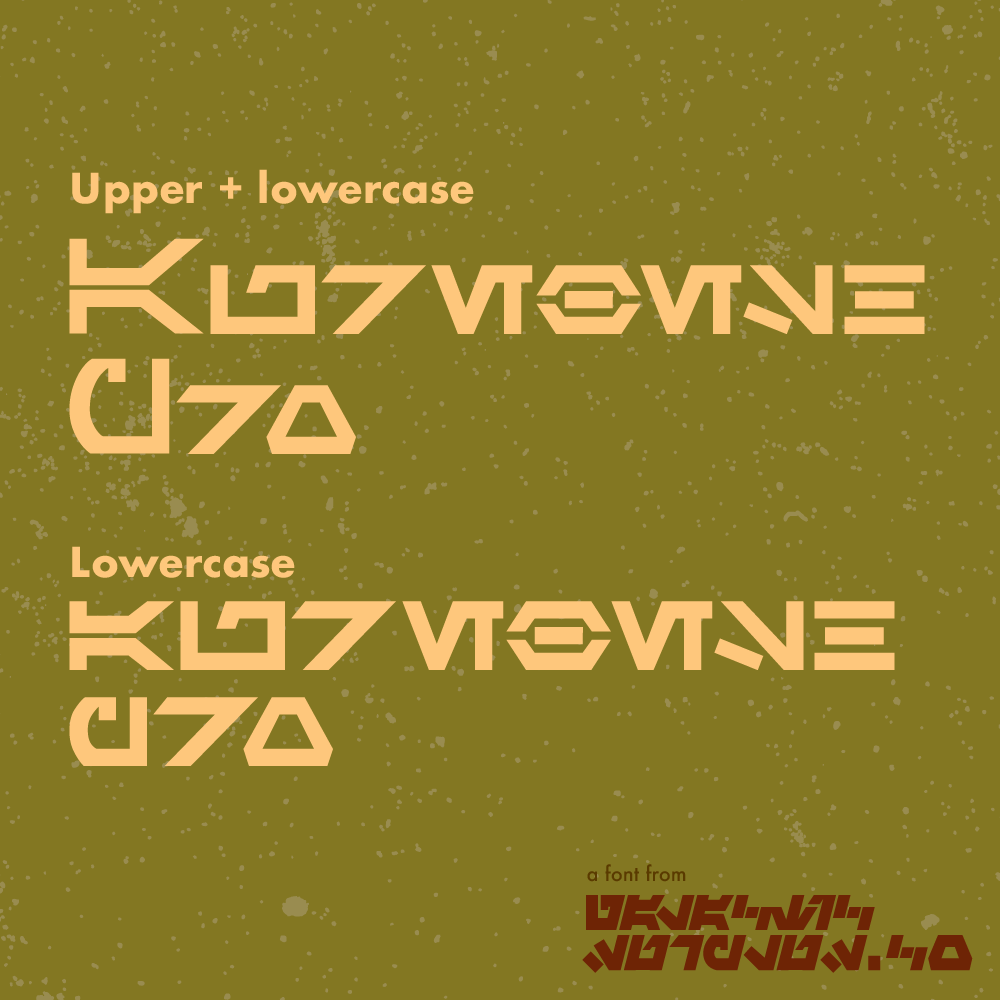
What's with the capitals?
So. I'm firmly in the camp of "Aurebesh Capitals aren't flipped horizontally," But I didn't want to copy the glyphs from lowercase to uppercase. Like, what's the point? But then I was re-watching Rebels and noticed some Aurebesh on the walls of Lothal, and they had capitals that were larger than their lowercase counterparts. That's when I realized my Capitals would be the same letterform but larger in size but the same weight as their lowercase counterparts. So with Aurebesh Pro, you can type all lowercase, upper, and lowercase or just uppercase.
Where are the digraphs?
Simply put I don't believe in digraphs. I believe they are old and part of a specific generation of Aurebesh fonts. And if you see them used on screen is because nobody knows better. I personally don't like them. Since this was my font I didnt include any. But you get a bunch of weights so... bargain!What's the future of Aurebesh Pro?
As of this writing, we've released two versions of the font. You get all future updates with the purchase of the font. At the same time, I'm still tinkering with some letterforms when I encounter a problem while designing with it. It's nearing completion. I am considering making a legitimate italic version of the weights—more on that in a future update.
Why isn't this font free?
Simple. Work costs time, and time is money. Is $10 (used to be $30!) a lot for a font with seven weights? Maybe. You wouldn't ask a bounty hunter for free work—same deal.